 4
4TimeTick
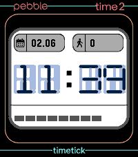
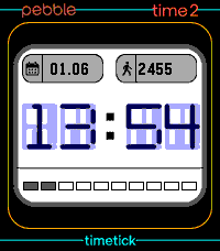
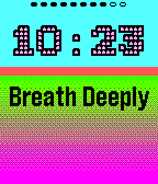
FacesTimeTick | Minimalist Precision for Pebble TimeTick is a watchface built for the moment you need the time, the date, and your daily stats; without the noise. It’s designed for the Pebble Emery, prioritizing readability and battery efficiency over clutter. No fluff, no distractions, just the data you actually need. What you get: Purposeful Display: High-contrast, large digits that are easy to read at a glance. No squinting, no confusion, but with retro-love. Essential Context: The date and your step count are always there, integrated naturally into the layout. Smart Weather: I handle the weather your way. If you have an OpenWeatherMap API key, great, so hook it up. If not, TimeTick automatically defaults to the free Open-Meteo service. No setup required, just works. Battery Management: A simple, honest battery bar. I fetch weather data on-demand (via wrist flick or tap) to keep your phone’s GPS and the watch's battery usage to a minimum. Cleanstyle (New): A toggleable masking layer. If you prefer a more contained aesthetic, enable Cleanstyle to place black bars at the top and bottom of your screen to frame the background image. Setup TimeTick is built to be a set-and-forget tool. Weather: Works out of the box with the Open-Meteo fallback. Adding an OpenWeatherMap key is optional. I integrated OpenWeatherMap (OWM) because it is the undisputed industry standard in weather data aggregation. Relying on an API that powers global meteorological services ensures that the data accuracy and uptime of TimeTick remain rock-solid, regardless of your location. Beyond its reliability, OWM is a strategic choice for the future of the watchface. While the current implementation is lightweight, OWM’s infrastructure is incredibly deep. This provides a clear roadmap for adding "cooler" features down the line without needing a backend overhaul. Because OWM offers comprehensive data; such as dynamic weather conditions, humidity levels, wind speeds, and UV indices, I have the potential to evolve TimeTick into a full-featured weather companion. I can easily transition from simple text-based temperature to graphical iconography or hourly forecasts whenever I´m ready to take the design to the next level. Permissions: Ensure your Pebble app has permission to access location data on your smartphone for the weather lookup to function. Developed by atomlabor. Optimized for Pebble Time 2 (Emery). https://atomlabor.de
 6
6TimeTick Watchface
DailyThis is my first attempt at a touchscreen watch face. Here you can view the time, steps, date and battery information, and if you tap the time, a countdown timer opens. Set it using the touchscreen and start it. An alarm sounds when the time is up. Unfortunately, it’s not currently possible to create a watch face with touchscreen functionality; instead, it has to be declared as an app. I’m hoping an SDK update will change that soon. Feel free to give it a go and let me know if you like it.
 35
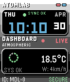
35ATOMLAB
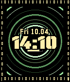
FacesATOMLAB is a clean, telemetry-inspired watchface designed for the Pebble ecosystem. It features a distinctive 3D-layered dashboard layout that provides critical data at a glance without cluttering the screen. Key Features: Dynamic Dashboard: High-contrast displays for time, date, and live weather telemetry (Temperature & Wind). Intelligent UI: Automatically adapts to Timeline Quick View, shifting layouts to keep your data visible. Secure Link Alerts: Real-time Bluetooth monitoring with haptic feedback and visual status indicators. Health Integration: Seamless tracking of heart rate and step counts directly on the main interface. Multi-Platform Support: Precision-engineered for Chalk, Gabbro (Round 2), Emery, and classic rectangular Pebble models. Use your OpenWeather Free API Key in the settings for your exact weather update.
 52
52WikiRadius
Tools & UtilitiesWhether you are a tourist exploring a new city or a local wanting to uncover the hidden history of your hometown: WikiRadius turns every simple walk into an interactive journey of discovery. The app uses your smartphone’s high-precision GPS to scan your current coordinates and automatically delivers fascinating facts about landmarks, historical sites, and geographical features right to your wrist. No manual searching required, just start walking, and the world around you begins to "speak". How the Smart 3-Stage Radar Works WikiRadius isn't a normal browser; it's a pure "location-to-information" bridge. To always show you the most relevant destination, an intelligent search logic works in the background in three stages: Local Area (200m): The app primarily searches for major, relevant Wikipedia articles in your immediate vicinity. Monument Scanner (200m): If there is no Wikipedia entry, WikiRadius taps into OpenStreetMap, explicitly searching for hidden historical monuments or structures (historic). Wide-Angle Radar (1km): If your direct surroundings are completely empty, the app automatically expands its search radius to 1,000 meters to find the next major destination for you. Display Symbols Explained So you know exactly what the radar has locked onto at a glance, WikiRadius uses special visual indicators in the headline: No Prefix (e.g., Space Needle): A classic Wikipedia article in your immediate vicinity (under 200m). The [H] Symbol (e.g., [H] Old Water Tower): A historical monument, building, or relic found via the OpenStreetMap scanner. The Double Arrow >> (e.g., >> Golden Gate Bridge): A destination from the wide-angle radar. It is further away (up to 1km) but serves as an excellent long-distance goal for your walk. Once you cross the 200m mark, the arrow disappears. Key Features Live Navigation Cockpit: A smooth real-time compass and dynamic distance display guide you to your discovery, meter by meter. Smart Feedback: Your watch vibrates subtly only when a new destination appears on the radar. No annoying continuous vibrations while navigating. Universal Compatibility: Flawlessly supports all Pebble models (Emery, Basalt, Chalk, Diorite, Aplite, Gabbro...), adapting its UI perfectly to round, rectangular, color, and monochrome screens. Independent Integration: WikiRadius retrieves public data from the Wikipedia API and Overpass API to deliver high-quality knowledge. However, the app is not affiliated with, endorsed by, or connected to the Wikimedia Foundation or OpenStreetMap. It acts purely as an independent, location-based client. Discover what you would have otherwise just walked right past. Best https://atomlabor.de
 20
20Remember Me
FacesSubconscious Focus. On the Run. Remember Me is not just another task manager or a sticky note on your wrist... it is a cognitive tool designed to keep your most important intentions where they belong: at the forefront of your mind. In a world full of digital noise, we often forget the small but vital promises we make to ourselves: to breathe, to smile, to stay hydrated, or to maintain a specific mindset. Remember Me bridges the gap between your intention and your subconscious. How it works: The app follows a "Keep in Mind" philosophy. By placing up to three custom reminders directly under the time, you process your goals every time you check the clock. You don't just see the time; you see your purpose. Subconscious Conditioning: No intrusive notifications or buzzing alarms. The information is simply there, waiting for your eyes to graze it, allowing it to sink deeper into your brain with every glance. Tactile Interaction: Keep your focus fluid. Cycle through your three personal reminders with a simple flick of the wrist or a tap on the screen. Adaptive Design: Whether you are running through the city or sitting in a meeting, the high-contrast "Outline Mode" and large typography (up to 64px on Pebble Time 2) ensure your mantra is always legible. Features: Dynamic Reminders: Set three distinct fields for your habits, goals, or positive affirmations via the phone settings. Smart Layout: Optimized for all Pebble models. Special high-resolution support for Gabbro (Round 2) and Emery with massive, centered typography. Customization: Change the top background color and toggle between white or black outlines to match your style or environment. Battery & Status: Subtle battery indicators integrated into the design to keep you informed without distraction. Don't just track your life. Change your mindset. Keep it in mind with Remember Me. Don´t forget to like <3 Cheers atomlabor.de
 56
56Binary Glow
FacesA futuristic, high-tech watchface for the Pebble ecosystem. Binary Glow combines a classic "Matrix" aesthetic with a modern HUD (Heads-Up Display) feel, featuring dynamic animations and system monitoring at a glance. Tap your watch or flick your wrist to trigger a 5-second Glitch Protocol. The system core will visually destabilize with rapid color shifts and shifting ring geometry before recalibrating back to normal. Explore more from Atomlabor! Love the "Binary Glow" aesthetic? Make sure to check out my other watchfaces and apps to complete your Pebble setup! Every project is built with passion and precision to keep your tech looking sharp. Support the project. If you enjoy using this watchface, I would really appreciate a ❤️ Like in the Pebble App Store. Your support helps me keep the updates coming and the Matrix alive ;) ! Proudly made by atomlabor.de
 35
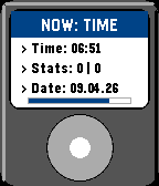
35Now: Time
FacesNOW: Time | The Classic iPod Watchface with last fm Turn your Pebble into a classic digital music player. NOW: Time combines pure early-2000s nostalgia with modern smartwatch features, bringing your current soundtrack and daily stats straight to your wrist. Features: Live Last.fm Sync: Connect your Last.fm account to display exactly what you are listening to right now. Long track names scroll smoothly across the screen so you never miss a beat. Shake to Play: Flick your wrist to switch from the standard time and date view to the music player. The display automatically switches back after 12 seconds to save battery. Classic Retro UI: Inspired by legendary MP3 players, featuring a clean clickwheel design and a subtle battery level indicator built right into the playbar. Health Integration: Keep an eye on your daily steps and current heart rate directly on the main screen (fully supported on Basalt, Emery, Diorite, and compatible models). Battery: The thin line directly above the playbar indicates your watch's current battery level. Deep Customization: Use the settings menu to pick your favorite header color, set a "Fallback Song" for when your music is paused, and toggle the vibration alerts for new tracks. Setup Note: To use the live music features, simply enter your Last.fm username in the settings. Please ensure your Last.fm profile is set to public so the watch can fetch your current tracks! Proudly made by atomlabor.de
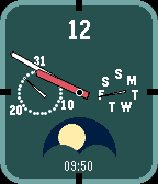
 29
29VANTAGE Round
FacesVANTAGE Round is a sophisticated, data-rich analog watchface tailored specifically for the circular displays of the Pebble Time Round (Chalk) and the high-resolution Pebble Round 2 (Gabbro). Building upon the original VANTAGE design ( https://apps.repebble.com/vantage_6970a55f04726500096d9975 ) for the Pebble Time 2, this circular edition brings a classic, refined aesthetic to your wrist without sacrificing functionality. Key Features: Dynamic Moon Phase: A custom-rendered, rotating moon complication that accurately tracks the current lunar cycle. Dual Sub-Dials: Keep track of your schedule with elegant, dedicated analog dials for the current Date and Day of the Week. Smart Night Mode: The watchface automatically transitions to a high-contrast, dark color palette between 10 PM and 6 AM for optimal readability in low light. Tap for Battery: Simply flick your wrist or tap the watch to temporarily reveal the exact battery percentage at the 12 o'clock position. Resolution Independent: Fully scalable vector hands and dynamically calculated layouts ensure perfect crispness on both standard (180x180) and high-density (260x260) screens. Cheers from https://atomlabor.de
 50
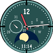
50VANTAGE
FacesVANTAGE is a high-precision analog watchface, now completely rebuilt and optimized for the entire Pebble ecosystem (Time 2, Time, Pebble 2, and Classic). Clean, calm, and made for everyday use. The look is deliberately classic, featuring a deep Midnight Green aesthetic for color displays and sharp, high-contrast styling for monochrome watches, inspired by traditional instruments. The dial is intentionally reduced and highly legible. Nothing flashes, nothing distracts. VANTAGE features a sophisticated, 100% vector-based moon phase at the 6 o'clock position. It is calculated down to the exact second for absolute astronomical accuracy, subtly integrated without relying on pixelated images, internet connections, or heavy memory usage. In daily use, VANTAGE dynamically adapts to system overlays. Utilizing Pebble's Unobstructed Area capabilities, the entire watchface smoothly glides out of the way when timeline pins or notifications (Quick Views) appear, ensuring the time and details are never cut off or hidden. From 10:00 p.m. to 6:00 a.m., VANTAGE enters a minimalist Stealth Mode. To reduce glare in dark environments, the background, borders, and sub-dials fade entirely into a pitch-black screen. The watch transforms into a radar-like instrument, leaving only the main hands illuminated in a striking glowing green (or pure white on monochrome displays). A quick shake or tap of the wrist reveals the battery percentage at the 12 o'clock position for a few seconds. It provides vital information only when you need it, without permanently cluttering the dial. Engineered with a lightweight, zero-crash architecture, VANTAGE V2 is exceptionally fast, battery-efficient, and rock-solid on your wrist. Feedback is always welcome. Feel free to try VANTAGE in your everyday life and share your thoughts. If you got a Pebble Round (PR2) than take a look here: https://apps.repebble.com/47f0856e24654a89b689f12a Reach out: pebble@atomlabor.de Web: atomlabor.de
 49
49THE ROYAL
FacesThe Royal The appearance of The Royal is defined by a strict visual order and a mathematically balanced colour concept. At its core lies the equilibrium between surface, structure, and accent. The 60-30-10 Rule The design strictly adheres to the classical principle of harmonious colour distribution. This ratio ensures that the eye is guided naturally, without being overwhelmed: 60% Dominant Colour: The background forms the calm foundation and defines the primary mood. 30% Secondary Colour: Structural elements, such as the frame and typographic displays, provide the watch face with form and depth. 10% Accent Colour: A purposeful highlight—the central badge—marks the visual focus and emphasises the date. Dynamic Compositions The palette is not static; it responds to the passing of the day. Four finely tuned compositions transition automatically to reflect the shifting ambient light: Sunrise: A light, crisp start to the day. Noon: Bold contrasts for optimal legibility in broad daylight. Golden Hour: Warm, saturated tones for the transition into evening. Midnight: Subdued, dark hues for an unobtrusive presence during the night. Mechanics and Interaction The symmetry of the display remains undisturbed in idle mode. If the idle mode is interrupted by a shake of your wrist, a disturbance is generated.
 39
39AtomWave
FacesTime in Flow. AtomWave 2.2 visualises the passing of time through organic fluid physics. Watch as your screen fills with water, rising from the bottom at minute 0 to full immersion by minute 60. Key Features: Hourly Tide: The water level intuitively tracks the minutes of the current hour. Smart Contrast: Typography automatically inverts colours when submerged (White on Black vs. Black on Colour) for perfect readability. Battery Reactive: The water colour changes to reflect your battery status (Blue > Yellow > Pink). Living World: Features a dynamic starfield, rising bubbles, and gentle wave physics. Hidden Details: Keep an eye out for rare events deep underwater. Best atomlabor.de
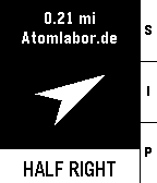 75
75PureNavi
Tools & UtilitiesPureNavi is a minimalist, highly efficient straight-line navi. Instead of distracting you with complex maps, PureNavi delivers navigation in its purest form. A single arrow and the exact distance to your destination. Nothing more. Nothing less. The v2 update introduces a refined hybrid engine that intelligently combines GPS and compass data. This ensures a smooth, stable needle that stays on course whether you are moving at pace or standing still. You can also pin your current position instantly with a single button press. This is perfect for finding your car again or marking any spot you want to return to later. PureNavi navigates exactly as the crow flies. Direct. Clear. Focused.