THE ROYAL
atomlabor

Watchface
Description
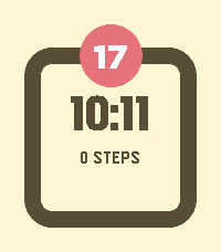
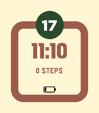
The Royal
The appearance of The Royal is defined by a strict visual order and a mathematically balanced colour concept. At its core lies the equilibrium between surface, structure, and accent.


The 60-30-10 Rule
The design strictly adheres to the classical principle of harmonious colour distribution. This ratio ensures that the eye is guided naturally, without being overwhelmed:

60% Dominant Colour: The background forms the calm foundation and defines the primary mood.

30% Secondary Colour: Structural elements, such as the frame and typographic displays, provide the watch face with form and depth.

10% Accent Colour: A purposeful highlight—the central badge—marks the visual focus and emphasises the date.

Dynamic Compositions
The palette is not static; it responds to the passing of the day. Four finely tuned compositions transition automatically to reflect the shifting ambient light:

Sunrise: A light, crisp start to the day.

Noon: Bold contrasts for optimal legibility in broad daylight.

Golden Hour: Warm, saturated tones for the transition into evening.

Midnight: Subdued, dark hues for an unobtrusive presence during the night.

Mechanics and Interaction
The symmetry of the display remains undisturbed in idle mode. If the idle mode is interrupted by a shake of your wrist, a disturbance is generated.
- Developeratomlabor
- CategoryFaces
- PlatformsOG Pebble, Steel, Time/Time Steel, Time Round, 2, 2 Duo, Time 2, Round 2
- Updated2026-03-04
- Version2.1